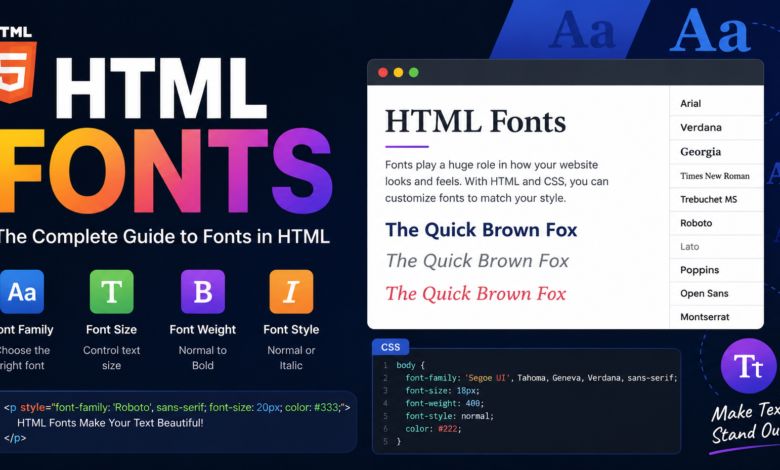
Introduction to HTML Fonts
HTML Fonts, When building a website, typography plays a much bigger role than many people realize. The right font can improve readability, strengthen your brand, and create a better experience for visitors. This is why understanding HTML fonts is essential for anyone interested in web development, whether you’re a beginner creating your first webpage or an experienced developer refining a professional website. Fonts influence how users perceive your content, making them one of the most important visual elements in modern web design.
In the early days of the web, developers had very limited font choices because websites depended on fonts already installed on users’ computers. Today, the situation has changed dramatically. Modern browsers support thousands of web fonts through CSS and online font libraries, allowing designers to create unique and attractive websites without sacrificing compatibility. Even though CSS controls most font styling today, people still refer to the topic as HTML fonts, making it an important concept to understand.
This guide explains everything you need to know about HTML fonts, including how they work, the different font families available, how to change fonts, best practices, accessibility considerations, and common mistakes to avoid. By the end of this article, you’ll have a solid understanding of how to make your website look polished and professional through effective typography.
What Are HTML Fonts?
HTML fonts refer to the typefaces displayed on a webpage. While HTML provides the structure of a webpage, CSS controls the appearance of text, including the font family, size, weight, style, spacing, and color. Although the old <font> tag once handled these tasks, it has long been deprecated in favor of CSS because CSS offers greater flexibility and cleaner code.
Modern websites typically use the font-family property to specify fonts. This property allows developers to list multiple fonts, creating a fallback system. If a visitor’s device doesn’t support the first font, the browser automatically uses the next available option. This ensures that text remains readable regardless of the user’s operating system or browser.
Another important aspect of HTML fonts is responsiveness. Fonts should look great on desktops, tablets, and smartphones alike. Responsive typography ensures that users enjoy a consistent reading experience across all devices without needing to zoom or adjust their screens.
Why HTML Fonts Matter in Web Design
The importance of HTML fonts extends far beyond aesthetics. Typography directly impacts readability, user engagement, and the overall perception of your website. Visitors often decide within seconds whether they want to stay on a page, and readable fonts play a significant role in that decision.
Good typography also helps establish a brand identity. Luxury brands often use elegant serif fonts, while technology companies frequently prefer clean sans-serif fonts. Choosing the right typography helps reinforce your message and create a memorable impression.
Search engines also benefit from proper typography. While fonts themselves aren’t direct ranking factors, improved readability increases user engagement, reduces bounce rates, and encourages visitors to spend more time on your site. These positive user signals can indirectly support your SEO efforts.
Common Font Families Used in HTML
One of the first things you’ll learn about HTML fonts is that fonts are organized into different families. Each family offers a unique appearance and works best in different situations.
Serif fonts feature decorative strokes at the ends of letters. These fonts often convey professionalism, tradition, and elegance. Popular examples include Times New Roman, Georgia, and Garamond. Many news websites and formal publications continue using serif fonts because they provide an established and trustworthy appearance.
Sans-serif fonts remove decorative strokes, resulting in a cleaner and more modern look. Arial, Helvetica, Verdana, and Roboto are widely used examples. Most modern websites choose sans-serif fonts because they remain highly readable across different screen sizes and resolutions.
Other font families include monospace fonts, where every character occupies equal width, making them ideal for displaying code. Script fonts mimic handwriting and work well for decorative elements, while fantasy fonts are creative and unique but should be used sparingly to avoid readability issues.
How to Apply HTML Fonts Using CSS
Applying HTML fonts is straightforward thanks to CSS. The most common property is font-family, which specifies the desired typeface.
In this example, the browser first attempts to use Arial. If Arial isn’t available, it switches to Helvetica. If neither font exists, it falls back to any available sans-serif font. This layered approach improves compatibility across devices.
Developers can also customize font size, style, weight, spacing, and line height. Combining these properties creates visually balanced content that’s comfortable to read. Instead of relying on fixed pixel values everywhere, many designers use relative units like em and rem to create scalable typography that adapts to different devices.
Web Fonts vs. System Fonts
A common question about HTML fonts involves choosing between system fonts and web fonts. Each option has its own advantages.
System fonts are already installed on users’ devices. Because they don’t require downloading additional files, websites load faster. Popular system fonts include Arial, Times New Roman, Georgia, and Verdana. These fonts offer excellent performance and compatibility.
Web fonts, on the other hand, are downloaded from online services or self-hosted files. They provide greater creative freedom because designers can use unique typefaces regardless of the visitor’s installed fonts. Google Fonts has become one of the most popular sources for free web fonts.
The best choice depends on your priorities. If performance is your main concern, system fonts are an excellent option. If branding and visual uniqueness matter more, web fonts provide significantly more flexibility.
Best Practices for Choosing HTML Fonts
Selecting effective HTML fonts involves more than simply choosing attractive typefaces. Good typography balances readability, aesthetics, and performance.
First, always prioritize readability. Body text should remain easy to read across all screen sizes. Highly decorative fonts may look beautiful in headings but often become difficult to read in long paragraphs.
Second, avoid using too many different fonts on a single webpage. Limiting yourself to two or three complementary fonts creates consistency while keeping the design organized. Excessive font variation can make a website feel cluttered and unprofessional.
Finally, pay attention to spacing. Proper line height, letter spacing, and paragraph spacing greatly improve reading comfort. Even an excellent font can become difficult to read if spacing is poorly configured.
Accessibility and HTML Fonts
Accessibility should always be considered when working with HTML fonts. Every visitor deserves a comfortable reading experience, regardless of visual ability or device.
Choose fonts with clear letterforms that distinguish similar characters like uppercase “I,” lowercase “l,” and the number “1.” This helps users avoid confusion, especially those with visual impairments.
Maintain sufficient font size for body content. Most accessibility guidelines recommend at least 16 pixels for regular text. Larger sizes often improve readability further, particularly on mobile devices.
Color contrast is equally important. Dark text on a light background usually provides the best readability. Avoid low-contrast combinations that make text difficult to distinguish, especially for users with limited vision.
Common Mistakes to Avoid with HTML Fonts
Even experienced developers occasionally make mistakes when selecting HTML fonts. Fortunately, most of these issues are easy to prevent.
One common mistake is using decorative fonts throughout an entire webpage. While these fonts may look appealing in logos or headings, they often reduce readability in long-form content.
Another mistake involves ignoring fallback fonts. If your preferred font fails to load, visitors may see inconsistent typography unless you’ve specified appropriate alternatives in the font-family property.
Some developers also overlook performance. Loading numerous font files with multiple weights and styles increases page loading time. Limiting font variations improves website speed while maintaining a professional appearance.
Future Trends in HTML Fonts
The future of HTML fonts continues to evolve as browser technology improves. Variable fonts have become increasingly popular because they allow multiple font weights and styles within a single file. This reduces loading times while providing greater design flexibility.
Responsive typography is another growing trend. Modern CSS allows font sizes to scale smoothly based on screen dimensions, ensuring consistent readability across every device.
Artificial intelligence is also beginning to influence typography by helping designers choose font combinations, optimize readability, and personalize user experiences. As web technology advances, typography will continue becoming smarter, faster, and more adaptable.
Conclusion
Understanding HTML fonts is one of the most valuable skills for anyone creating websites. Typography influences readability, branding, accessibility, user engagement, and overall design quality. By choosing appropriate fonts, maintaining consistent spacing, using fallback options, and following accessibility best practices, you can create websites that look professional and provide an outstanding user experience.
Whether you prefer fast-loading system fonts or visually distinctive web fonts, the key is selecting typography that supports your content rather than distracting from it. As web design continues evolving, mastering HTML fonts will remain an essential part of building attractive, functional, and user-friendly websites. By applying the principles discussed in this guide, you’ll be well-equipped to create webpages that are both beautiful and easy to read.
You May Also Read: Codes for Anime Card Clash