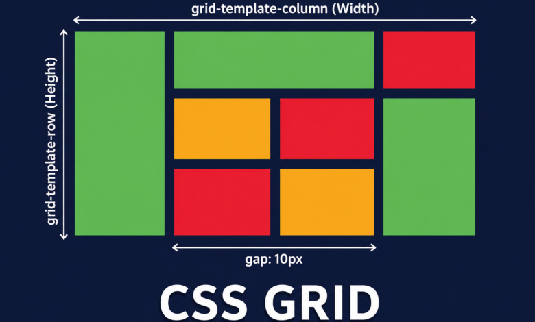
Creating beautiful and responsive websites has become much easier over the years, and one of the biggest reasons for that is CSS Grid. Before Grid was introduced, developers had to rely on floats, positioning, inline-blocks, and later Flexbox to build layouts. While those methods worked, they often required complicated workarounds and extra code. CSS Grid changed everything by giving developers a powerful two-dimensional layout system that is both flexible and easy to understand.
Whether you’re designing a personal portfolio, an online store, a company website, or a web application, CSS Grid allows you to create structured layouts with less effort. Instead of fighting against the limitations of older layout techniques, you can focus on building clean, organized, and responsive designs that look great on every screen size.
If you’re just getting started with web development or you’ve been writing CSS for years, learning CSS Grid is one of the best investments you can make. Once you understand how it works, you’ll spend less time fixing layout problems and more time creating websites that are visually appealing and user-friendly.
What Is CSS Grid and Why Does It Matter?
CSS Grid is a layout system built directly into CSS that allows developers to arrange elements into rows and columns. Unlike older methods that mainly worked in one direction, Grid handles both horizontal and vertical layouts at the same time. This makes it ideal for creating complete page structures without relying on complex hacks.
One of the biggest reasons CSS Grid has become so popular is its simplicity. With only a few CSS properties, you can create layouts that once required dozens of lines of code. Developers no longer need to calculate percentages manually or use unnecessary wrapper elements just to align content correctly.
Another advantage is browser support. Modern browsers fully support CSS Grid, making it a reliable choice for professional websites. As web standards continue to evolve, Grid has become one of the core technologies every front-end developer should understand.
Understanding the Basic Structure of CSS Grid
Every CSS Grid layout starts with a grid container. This is simply an HTML element that has the display: grid; property applied to it. Once an element becomes a grid container, all of its direct children automatically become grid items that can be positioned inside the layout.
Rows and columns form the foundation of every grid. Developers define them using properties such as grid-template-columns and grid-template-rows. These properties make it easy to specify exactly how much space each section of the layout should occupy.
Grid lines are another important concept. Every row and column creates invisible lines that can be used to position elements precisely. Instead of depending on margins or absolute positioning, developers simply tell an item which grid lines it should start and end on, resulting in cleaner and more maintainable code.
Why CSS Grid Is Better Than Traditional Layout Methods
Before CSS Grid, developers often used floats to build layouts. Although floats were originally designed for wrapping text around images, they became a common layout solution due to a lack of better alternatives. Unfortunately, they introduced many problems, including clearfix hacks and inconsistent behavior across different screen sizes.
Flexbox improved layout design by making it easier to align elements in a single direction. It remains an excellent tool for navigation bars, menus, and smaller interface components. However, Flexbox is primarily a one-dimensional layout system, meaning it works best either horizontally or vertically but not both simultaneously.
CSS Grid fills this gap perfectly. Since it is designed for two-dimensional layouts, it can control rows and columns together. This makes it ideal for entire page layouts, image galleries, dashboards, pricing tables, and magazine-style websites where precise positioning matters.
Building Responsive Designs with CSS Grid
Responsive design is essential because people browse websites using phones, tablets, laptops, and large desktop monitors. CSS Grid makes responsiveness much easier by allowing layouts to adapt automatically without requiring complicated calculations.
One of the most useful Grid features is the repeat() function combined with minmax(). These functions allow developers to create flexible columns that automatically resize based on the available screen space. As a result, websites remain organized whether viewed on a small smartphone or a wide desktop monitor.
Another powerful feature is auto-fit and auto-fill. These values allow the browser to automatically determine how many columns can fit within the available width. Instead of writing multiple layout variations manually, developers can create designs that adjust naturally to different devices.
Essential CSS Grid Properties Every Developer Should Know
Learning a few core properties gives you the ability to build nearly any layout. The display: grid; property activates Grid, while grid-template-columns and grid-template-rows define the overall structure of the layout.
Spacing between elements is handled with the gap property. Unlike using margins everywhere, gap creates consistent spacing throughout the layout while keeping the code cleaner and easier to maintain. This small feature alone can significantly improve readability.
Other useful properties include justify-items, align-items, justify-content, and align-content. These control how elements are positioned inside the grid, making it simple to center content or align it exactly where you want it without using extra CSS tricks.
Practical Uses of CSS Grid in Real Projects
CSS Grid is incredibly versatile and can be used in almost every type of web project. Blog layouts are one of the most common examples. Developers can easily create sections for featured articles, sidebars, advertisements, and content without struggling with alignment issues.
Online stores also benefit greatly from CSS Grid. Product cards can automatically organize themselves into neat rows and columns regardless of the number of products displayed. This creates a consistent shopping experience that looks professional across all devices.
Business dashboards, analytics platforms, image galleries, portfolios, and news websites all rely on structured layouts that Grid handles exceptionally well. Since items can span multiple rows and columns, designers have far greater creative freedom than they had with traditional layout methods.
Common Mistakes Beginners Make with CSS Grid
One common mistake is confusing CSS Grid with Flexbox. Many beginners try to replace Flexbox entirely with Grid or vice versa. In reality, both technologies complement each other. Grid is ideal for page layouts, while Flexbox excels at arranging elements within individual components.
Another frequent mistake is overcomplicating layouts. CSS Grid is powerful, but that doesn’t mean every project requires a highly complex grid structure. Starting with simple rows and columns often produces cleaner, easier-to-maintain code than creating dozens of unnecessary grid areas.
Many new developers also ignore browser developer tools. Modern browsers include Grid overlays that visually display rows, columns, spacing, and grid lines. These tools make debugging significantly easier and help developers understand exactly how their layouts behave.
Best Practices for Using CSS Grid Effectively
Planning your layout before writing CSS can save a tremendous amount of time. Sketching the page structure helps identify where rows, columns, and major content sections belong. This makes the final implementation much more organized.
Combining CSS Grid with semantic HTML is another excellent practice. Using meaningful elements such as header, main, section, article, aside, and footer improves accessibility while making your code easier to understand for other developers.
Finally, remember that readability matters just as much as functionality. Use clear naming conventions, organize your CSS logically, and avoid unnecessary complexity. Clean code is easier to debug, easier to maintain, and much more enjoyable to work with over time.
Conclusion
CSS Grid has completely transformed the way developers build website layouts. It removes many of the limitations of older CSS techniques while providing a clean, intuitive, and highly flexible system for arranging content. Whether you’re creating a simple landing page or a complex web application, Grid gives you the tools to design layouts that are both visually appealing and responsive.
As modern web development continues to evolve, CSS Grid has become an essential skill rather than an optional one. Its ability to manage rows and columns simultaneously makes it one of the most powerful layout systems available today. When combined with Flexbox, semantic HTML, and responsive design principles, it enables developers to create fast, accessible, and professional websites with confidence.
If you’re serious about improving your front-end development skills, investing time in mastering CSS Grid is one of the smartest decisions you can make. The more you practice using it in real-world projects, the more natural it becomes, and before long you’ll wonder how developers ever built complex layouts without it.
You May Also Read: RAD Intel Stock